ShopDreamUp AI ArtDreamUp
Deviation Actions


Description
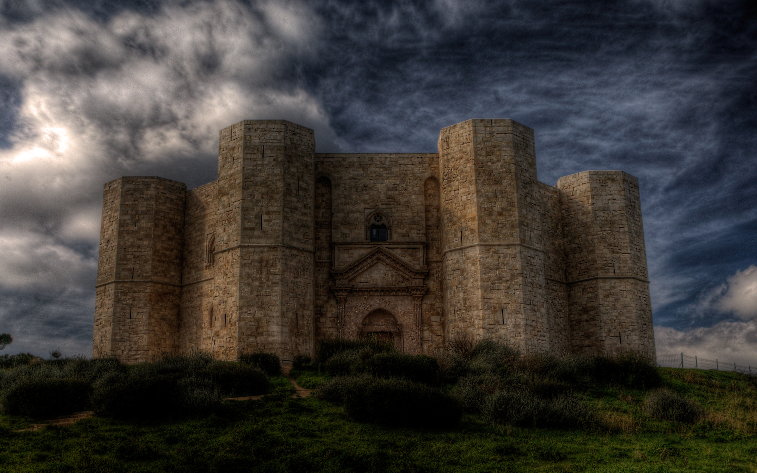
Castel del monte .
size 2560x1600.
The great castle built by Frederick ll, on which lie the mysterious legends.
Built around 1250 AD.
Located in southern Italy, in a town called Andria in the Puglia region.
wikipedia :[link]
bar on the left is the translation in all languages.
size 2560x1600.
The great castle built by Frederick ll, on which lie the mysterious legends.
Built around 1250 AD.
Located in southern Italy, in a town called Andria in the Puglia region.
wikipedia :[link]
bar on the left is the translation in all languages.
Image size
2560x1600px 2.63 MB
Model
NIKON D2X
Shutter Speed
1/30 second
Aperture
F/10.0
Focal Length
24 mm
ISO Speed
100
Date Taken
Feb 13, 2010, 1:31:53 PM
Comments125
Join the community to add your comment. Already a deviant? Log In
I like the concept that you were going for here but the way it was enacted was a bit off.
The Castle
I don't like pointing out inaccurate moments between art and history because art and history don't always line up or go hand in hand. But I have to say that castle's were traditionally more like defensive places. They were meant to be defensive and offensive so they would look a lot like what you have put up but also would have battlements and be flying the flag of the noble who resided in them. Your castle looks more like a church or a modern convention center made to look like a middle ages building. I notice this a photomanipulation though so is this a photo of the actual castle?
Lighting
I don't quite understand it. The right side of the castle is lite better than the left but the sky seems to be lighter on the left than the right despite the clouds. I think this could be fixed with a slight reflection action.
Other than the lighting and the castle there's nothing wrong or off about this photo. The way only a slight corner of the grass is lite and actually glows adds to the gloomy air and I'm in love with that patch of sky on the right. I just love that shade of blue in a sky. Nice pick of resources.